Are you looking to modify your kitchen? Want a new look and feel for the same? You have landed in the correct place! To completely change the look and feel of your kitchen, you must first select the best paint for cabinets.
With the appropriate paint, you can give your cabinets new life, increase their durability, and make your room feel light and airy. But there are so many choices that it can be difficult to choose. The best kitchen cabinet paint is dependent on a number of aspects, including durability, finish, paint type, and color choice.
Darker tones provide depth and drama, while lighter hues can give your kitchen a feeling of brightness and space. Take into account the general layout of your kitchen and the mood you want to set.
We’ll give you useful information and advice in this article to help you decide wisely and pick the kitchen cabinet paint that best suits your requirements and realizes your vision.
Let’s discuss it.
1. Consider Light and Orientation
Your options for cabinet colors are more varied if your kitchen has a lot of natural light. Colors often seem better and appear brighter when illuminated by natural light. To make a space feel spacious and open, choose brighter colors like whites, creams, light greys, or pastels. By reflecting the light, these colors will enlarge the room’s appearance. It is wise to select cabinet colors that have the potential to brighten a kitchen with inadequate lighting. Lighter colors are still a wonderful choice, but you might want to tilt on the side of warm tones like creamy whites, light beige, or gentle yellows.
Even in the kitchen with little natural light, these hues may provide warmth and create a pleasant, inviting atmosphere. The amount of light that enters your kitchen also depends on how it is oriented. Warm undertones like warm greys, creamy whites, or soft pastels can lend warmth to the north-facing kitchen’s cooler, indirect lighting. Most sunlight is absorbed by south-facing kitchens, giving designers more freedom with color schemes.
Light hues enhance the brightness, while deep hues like navy blue or deep grey give off a striking appearance. Pale yellows, gentle greens, or light greys are good for kitchens that face east because they take advantage of the morning light. Intense afternoon light from the west illuminates kitchens, making warm earth tones like warm browns, gentle oranges, or light terracottas ideal for creating a cozy atmosphere. Before making a choice, examine samples of colors in various lighting situations.
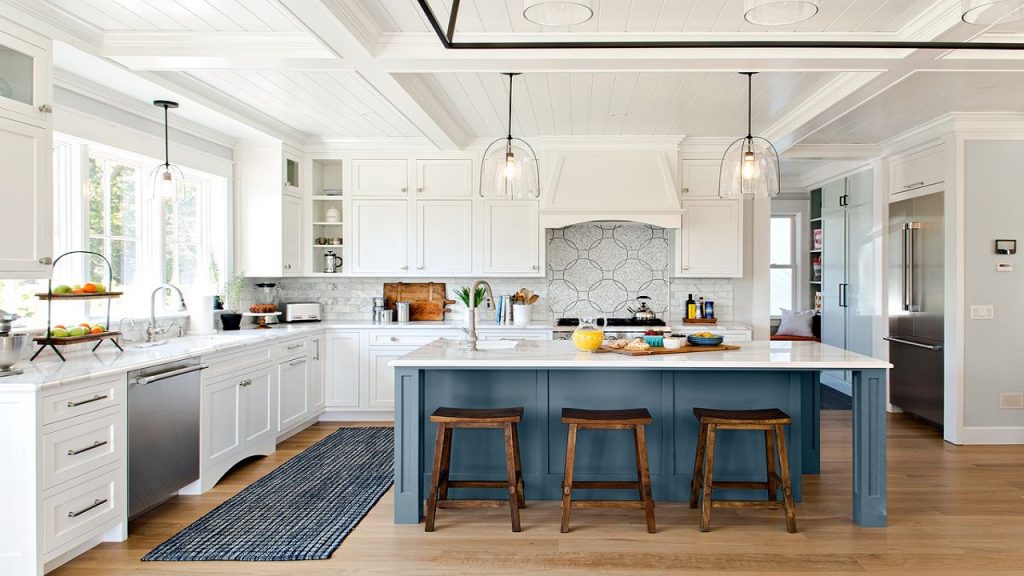
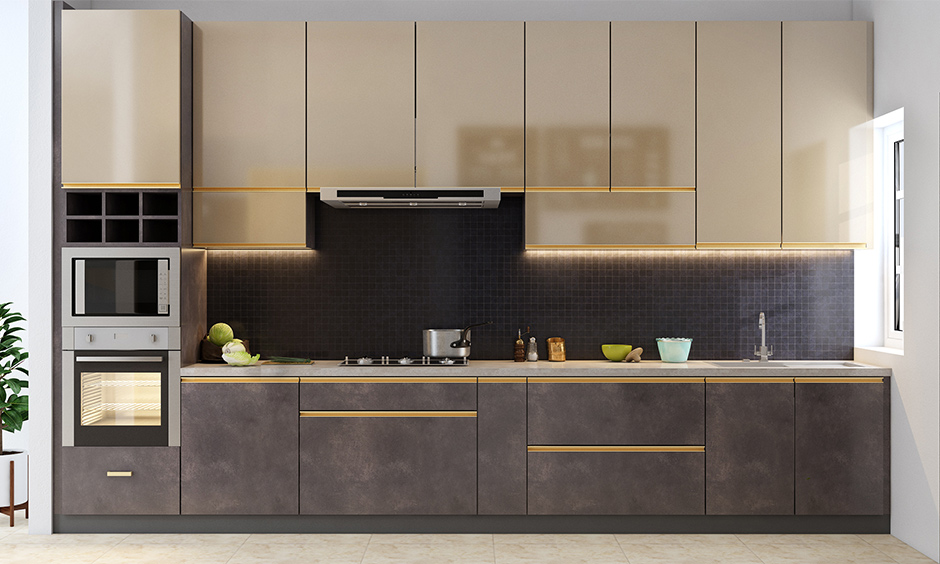
2. Consider Different Colours for Wall Units and Base Units
Different cabinet colors for base units and wall units can provide visual interest and give your kitchen a distinctive appearance. To make a visually striking effect and add depth to the kitchen design, you can contrast light and dark colors. For your wall units, choose a lighter hue, and for the base units, a darker hue. As an illustration, you may select deep charcoal or nay blue for the base units and white or light grey for the wall units.
Even better, you can go monochromatic by selecting several tones of the same color for the wall units and base units. This results in a polished and coordinated appearance. For instance, you may use a lighter shade of grey for the base units and a darker one for the wall units. By using this strategy, depth, and intrigue are added without the use of contrasting colors. You can think about blending painted surfaces with natural wood finishes. To provide coziness and a sense of the outdoors, give the wall units a wood finish. It should be paired with painted base units in a contrasting or complementary color.
Select a neutral color scheme for the wall units, such as white, beige, or light grey, for a neutral and accent color combination. These hues provide a traditional and adaptable setting. Then, for the base pieces, add a striking accent color like turquoise, scarlet, or mustard yellow. This combination gives your kitchen design a focal point and charm. Additionally, by choosing complementary colors for your wall units and base units, you can even get a two-tone appearance.
3. Think About Combinations, Tone, and Texture
To create a visually pleasing and coherent aesthetic, it’s crucial to consider combinations, tone, and texture when picking the color for your kitchen cabinets. For your kitchen cabinets, don’t be afraid to experiment with color combinations. To create depth and interest, think about combining two or more colors. For instance, you may paint the lower cabinets a deeper shade and the upper cabinets a lighter shade. As an alternative, you might make the kitchen island or a certain portion of cabinetry a different color to establish a focal point.
Consider the general atmosphere or tone you want to create in your kitchen. Lighter hues like white, cream, and pastels can produce a bright, airy environment that gives the illusion that the area is larger. Dark hues, on the other hand, can offer drama and refinement. Examples are deep blues, rich greys, and espresso browns. Choose cabinet colors that contrast with or complement the existing color scheme in your kitchen. Add texture to your kitchen cabinets to improve their aesthetic appeal.
To achieve a distinctive and tactile look, think about employing finishes like distressed, glazed, or brushed. In the end, your choice should be influenced by your preferences and personal style. Think about the hues that appeal to you and express your style and personality. Don’t be afraid to take chances and go with a color you adore, even if it’s a little out of the ordinary. After all, your kitchen need to reflect your own taste and character.
4. Don’t Forget Stains
To guarantee that your cabinets continue to remain lovely for many years to come, it is crucial to take upkeep and stains into account when picking a kitchen cabinet color. White, cream, and light grey cabinets are more forgiving with stains and smudges than darker hues. Compared to deeper colors, they conceal stains and flaws better, simplifying maintenance. However, if not properly maintained, lighter colors could become stained or discolored. It may be simpler to maintain your cabinet paint if you choose a semi-gloss or satin finish.
These coatings are easier to wipe clean and more stain-resistant. They also offer some degree of defense against elements that are frequent in culinary conditions, such as dampness, grease, and fingerprints. High-gloss coatings might give off a sleek and contemporary appearance, but they are more likely to reveal fingerprints, smudges, and scratches. To keep them in excellent condition, they could need more frequent cleaning and upkeep. Using a stain rather than paint on your wood cabinets can be a wonderful choice if you like its natural beauty. The inherent color and grain of the wood are enhanced by wood stains, which also offer some protection.
To make it simpler to clean and maintain, use a stain that has a clear protective coating. It’s always a good idea to test paint or stain samples on a small portion of your cabinets before making a final decision. This enables you to observe how various colors or finishes respond to stains and how simple it is to clean them. It also makes it easier for you to picture how the color will seem in the lighting of your kitchen.
5. Colour that Works with Your Countertops and Backsplash
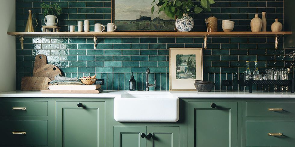
It’s important to take your countertops and backsplash into account when choosing a cabinet color for your kitchen. Select the countertops, backsplash, and cabinets that you wish to contrast or complement one another. Contrasting colors enhance the visual appeal and make each feature pop, whereas complementary colors produce a harmonious and cohesive appearance. Consider cabinets in a cool color that complements your warm-toned countertop or in a dark tint that contrasts with it.
Pay attention to the backsplash and countertop undertones. For a smooth transition, use a cabinet color with complementary undertones. Choose cabinets with warm undertones, for instance, if your countertops have warm tones. The color of your cabinets, countertops, and backsplash should complement one another without overpowering the room to create a balanced appearance. To create a sense of balance, think about choosing cabinets in a more neutral tint if your countertops and backsplash have dramatic patterns or vibrant colors.
Think about speaking with a kitchen designer or color specialist if you’re unsure about color combinations or need professional advice. They may offer insightful advice and recommend choices that complement the specific countertops and backsplash you have. Analyze how the cabinet color will affect your countertops and backsplash before making a decision. If you want to see how the colors blend, think about making sample boards or using digital visualization software.
Summing It Up
All in all, making the greatest kitchen cabinet paint selection is a crucial choice that may completely change the look of your kitchen and give it a fresh new look. Consider the ambiance and vibe you want to create in your kitchen when choosing the best paint for cabinets.
Your cabinets will look better overall and more coherent if you give them some texture and make sure the color blends with the rest of the design. Before making a final choice, remember to examine samples in the lighting of your kitchen to get a sense of how the colors will seem.
Your ability to select the best kitchen cabinet paint that will change your room, reflect your particular style, and create enduring beauty for years to come will be aided by these insights and advice.